In the previous post, "GitHub Universe Gradient Border Card", I showed you how to apply a gradient "fake" border for a card component.
This post will show you how to apply the gradient style for a button.
Slightly different as hover will change the whole button color instead of that of borders.
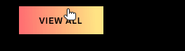
Demo:
Overview
Similar to the card component,
- Create a block element wrapping an anchor element
- Add ::before content, slightly smaller than the block element
- Add ::after content, which has the same size as the element
Details
Here is the "button" element (actually just an anchor that looks like a button).
1<div class="wrapper">2 <a href="#" class="button"><span>View All</span></a>3</div>
Button wrapper setup
As you will position borders using an absolute positioning with z-index,
you need to set the relative positioning and isolate so that z-index doesn't affect the rest of the document.
CSS variables defined here will be available to children.
--offset is the border width.
1.wrapper {2  position: relative;3  isolation: isolate;4
5  --width: 120px;6  --height: 40px;7  --offset: 2px;8}
Button setup
Create a transparent button without anchor underline.
The size should use the dimension defined in main element.
transition makes the color change more graceful, less jumpy.
1.button {2  width: var(--width);3  height: var(--height);4
5  text-decoration: none;6  color: white;7  background: transparent;8
9  transition: color 0.3s ease-in-out;10
11  /* rest is for setting link style/position */12  ...;13}
Button Background
The content area of .button::before will provide the button background.
Absolutely position the background smaller than half of offset on each side (top/left/width/height).
to show the border through it.
z-index: -1 will let .button content (<span>View All</span>) to show up on top of the background.
1.button::before {2  display: block;3  content: "";4  position: absolute;5
6  top: calc(var(--offset) / 2);7  left: calc(var(--offset) / 2);8  width: calc(var(--width) - var(--offset));9  height: calc(var(--height) - var(--offset));10  background: #000;11  z-index: -1;12}
Button Border
Absolutely position the border, which has the same size as .button.
It should show up behind the content as well as the background (z-index: -3).
But since the border content is bigger than the background, .button::after will look like a border for the button.
1.button::after {2  display: block;3  content: "";4  position: absolute;5
6  top: 0;7  left: 0;8  width: var(--width);9  height: var(--height);10
11  /* Gradient copied from GitHub Universe 2020 */12  background: linear-gradient(267.91deg, #ffe57f 9.35%, #ff7170 96.48%);13
14  z-index: -3;15}
Changing colors on hover
When you hover over the button, setting the background color opacity transparent will make the button same color as the border.
.button:hover is optional as the text looks better in this case as black.
1.button:hover {2 color: #000;3}4.button:hover::before {5 opacity: 0;6}