GitHub Universe has a list of "boxes" with gradient backgrounds.
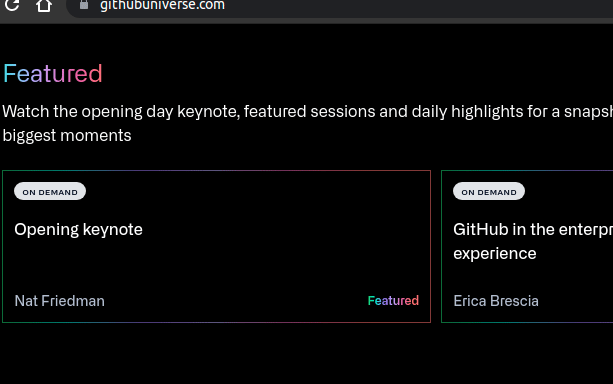
They aren't really borders but faked to look so.
Here is the demo.
Overview
Here is how the card is implemented.
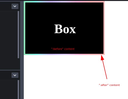
- Create a block element
- Add a ::before content, which is slightly smaller than the block element
- Add an ::after content, which has the same size as the element
Details
Size and Location
First, we need to set the size of the element, ::before, and ::after.
--offset is the "border width" (named so because they aren't really border width".)
- .box has the width/height - offset value (emulating box-sizing: border-box)
- .box::before has the same size as .box but moved down-right by half the amount of the offset
- .box::after takes up the full width/height. The offset amount will show throuh .box::before as a border.
Note that display: "block"; (or inline-block) is required to be able to set width/height.
1.box {2  --width: 300px;3  --height: 200px;4  --offset: 15px;5
6  width: calc(var(--width) - var(--offset));7  height: calc(var(--height) - var(--offset));8}9
10.box::before {11  display: "block";12  top: calc(var(--offset) / 2);13  left: calc(var(--offset) / 2);14  width: calc(var(--width) - var(--offset));15  height: calc(var(--height) - var(--offset));16}17
18.box::after {19  display: "block";20  top: 0;21  left: 0;22  width: var(--width);23  height: var(--height);24}
Positioning Pseudo Elements
Without content, pseudo elements wont' show. To place content with top/left relative to the current element, we can position them with absolute.
1.box::before {2  content: "";3  position: absolute;4  ...;5}6
7.box::after {8  content: "";9  position: absolute;10  ...;11}
Setting Background Colors
The main content's background color is applied in ::before, while the border color is in ::after.
1.box::before {2  background: #000;3}4
5/* Background linear gradient here is shown as a border */6.box::after {7  /* a cool background copied from GH Universe */8  background: linear-gradient(9    269.16deg,10    #ffe580 -15.83%,11    #ff7571 -4.97%,12    #ff7270 15.69%,13    #ea5dad 32.43%,14    #c2a0fd 50.09%,15    #9867f0 67.47%,16    #3bf0e4 84.13%,17    #33ce43 105.13%,18    #b2f4b6 123.24%19  );20}
Showing Borders
For the :before content to show on top of :after, you need to set z-index values.
z-index in :before is higher than that of :after but lower than that of current block.
e.g.
1.box {2  /* no z-index needed */3}4
5.box::before {6  z-index: -1;7}8
9.box::after {10  z-index: -3;11}
Changing Border Color on Hover
If you want to change the border brighter on hover,
we can set the opacity of gradient (in ::after) lower, and increase it on hover.
1.box::after {2  opacity: 0.7;3}4
5.box:hover:after {6  opacity: 1;7}
Showing a list of "Boxes".
The above code will work for a box only.
("borders" will overlap with other boxes without following instruction.)
To show a list of boxes, you need to wrap each block element with another block element, with position: relative applied.
Or else "borders" will overlap because of position: absolute for the box.
List of boxes
1<main>2 <div class="relative"><div class="box">Box1</div></div>3 <div class="relative"><div class="box">Box2</div></div>4 <div class="relative"><div class="box">Box3</div></div>5 <div class="relative"><div class="box">Box4</div></div>6 <div class="relative"><div class="box">Box5</div></div>7 <div class="relative"><div class="box">Box6</div></div>8</main>
Updated CSS
Demo: https://codepen.io/dance2die/pen/xxqamLa?editors=1100
Updated CSS also fixes the .box size.
1main {2  --offset: 20px;3
4  display: flex;5  justify-content: space-between;6  align-items: center;7  gap: calc(var(--offset) * 2);8
9  padding: 1.5rem 1rem;10  height: 100%;11  width: 750px;12
13  overflow-x: scroll;14  position: relative;15}16
17.relative {18  position: relative;19}20
21.box {22  --width: 300px;23  --height: 200px;24
25  flex-shrink: 0;26  width: var(--width);27  height: var(--height);28  padding: calc(var(--offset) / 2);29
30  display: grid;31  place-items: center;32
33  color: white;34  font-size: 3rem;35  font-weight: bold;36}37
38.box::before {39  content: "";40  display: block;41  position: absolute;42  background: #000;43  top: calc(var(--offset) / 2);44  left: calc(var(--offset) / 2);45  width: calc(var(--width) - var(--offset));46  height: calc(var(--height) - var(--offset));47  z-index: -1;48}49
50.box::after {51  content: "";52  display: block;53  position: absolute;54  background: linear-gradient(55    269.16deg,56    #ffe580 -15.83%,57    #ff7571 -4.97%,58    #ff7270 15.69%,59    #ea5dad 32.43%,60    #c2a0fd 50.09%,61    #9867f0 67.47%,62    #3bf0e4 84.13%,63    #33ce43 105.13%,64    #b2f4b6 123.24%65  );66  opacity: 0.7;67  top: 0;68  left: 0;69  width: var(--width);70  height: var(--height);71  z-index: -3;72}73
74.box:hover::after {75  opacity: 1;76}